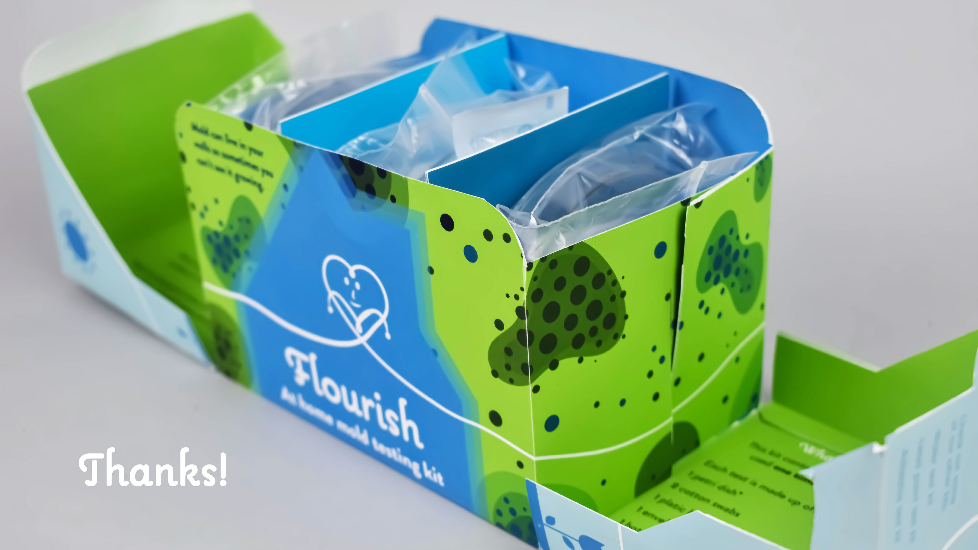
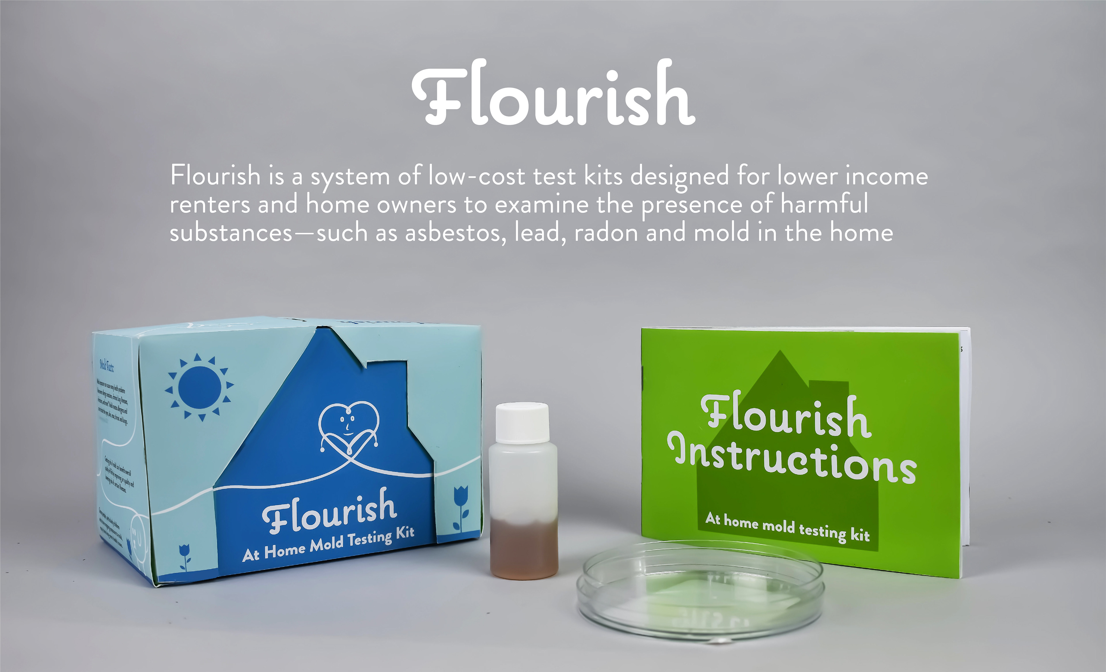
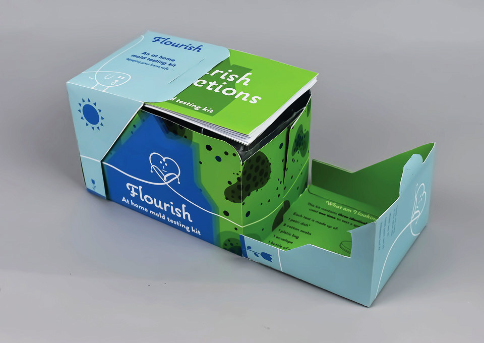
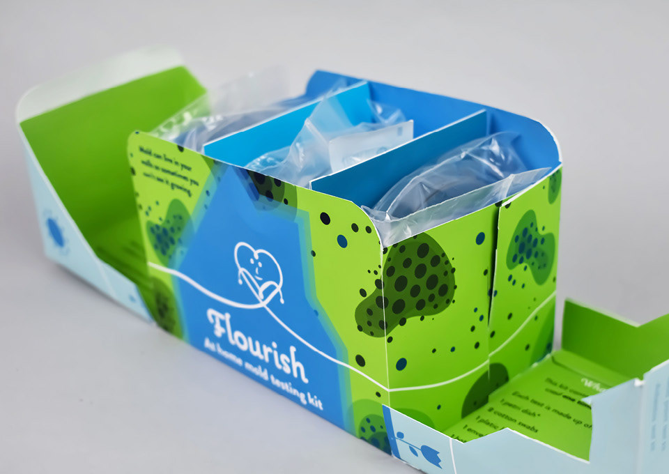
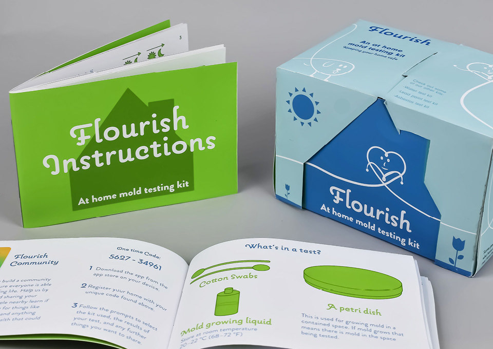
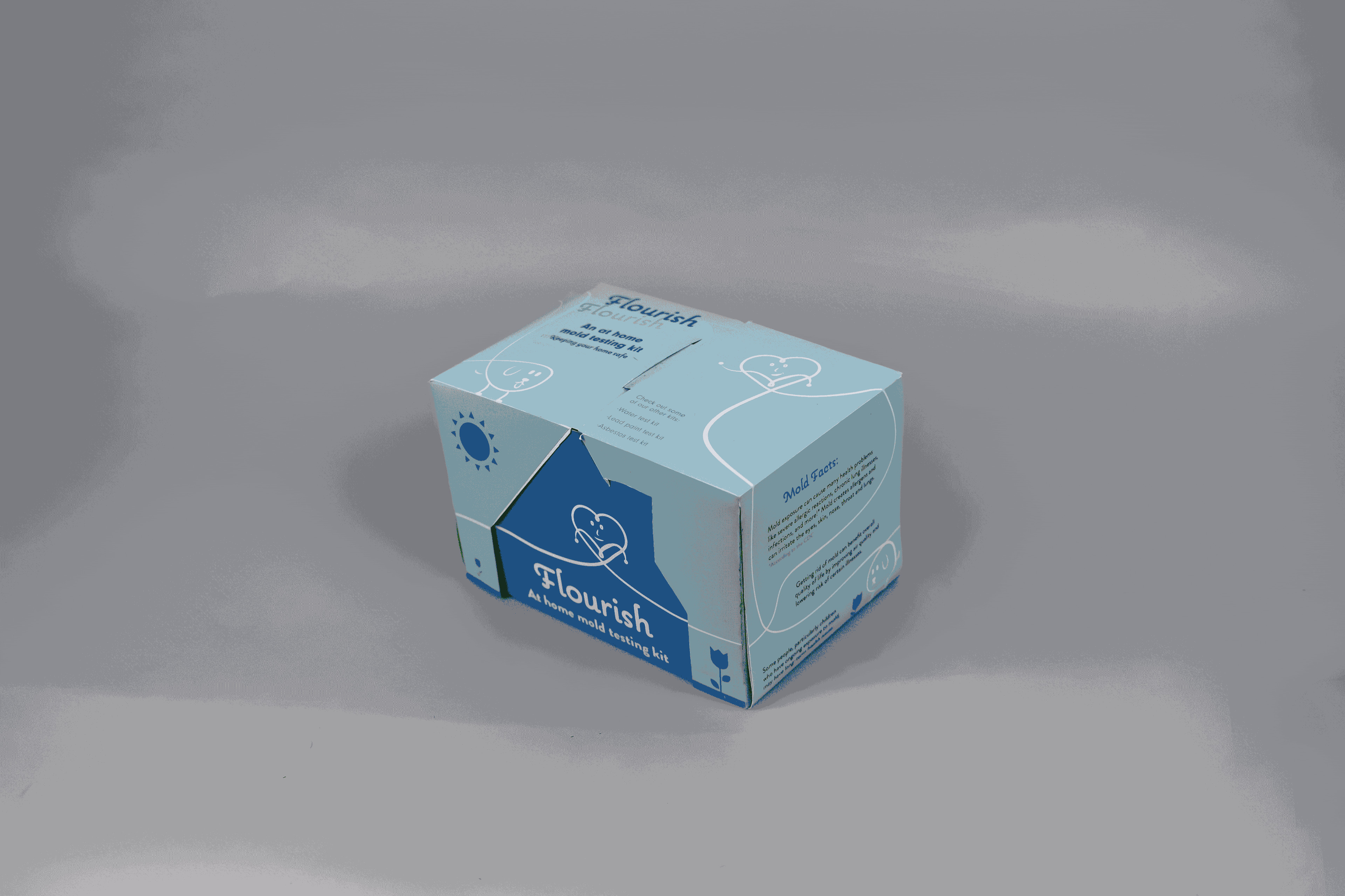
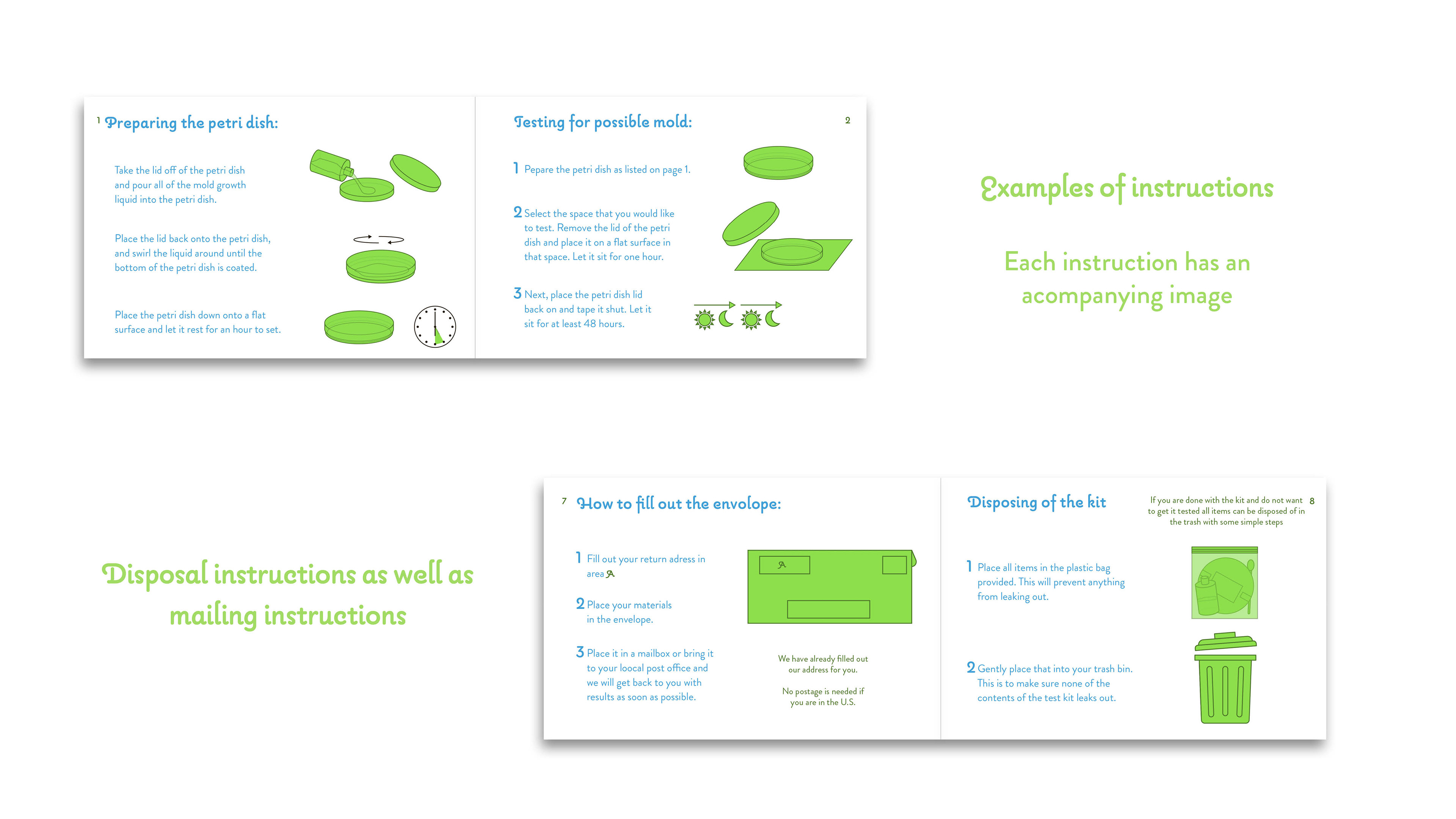
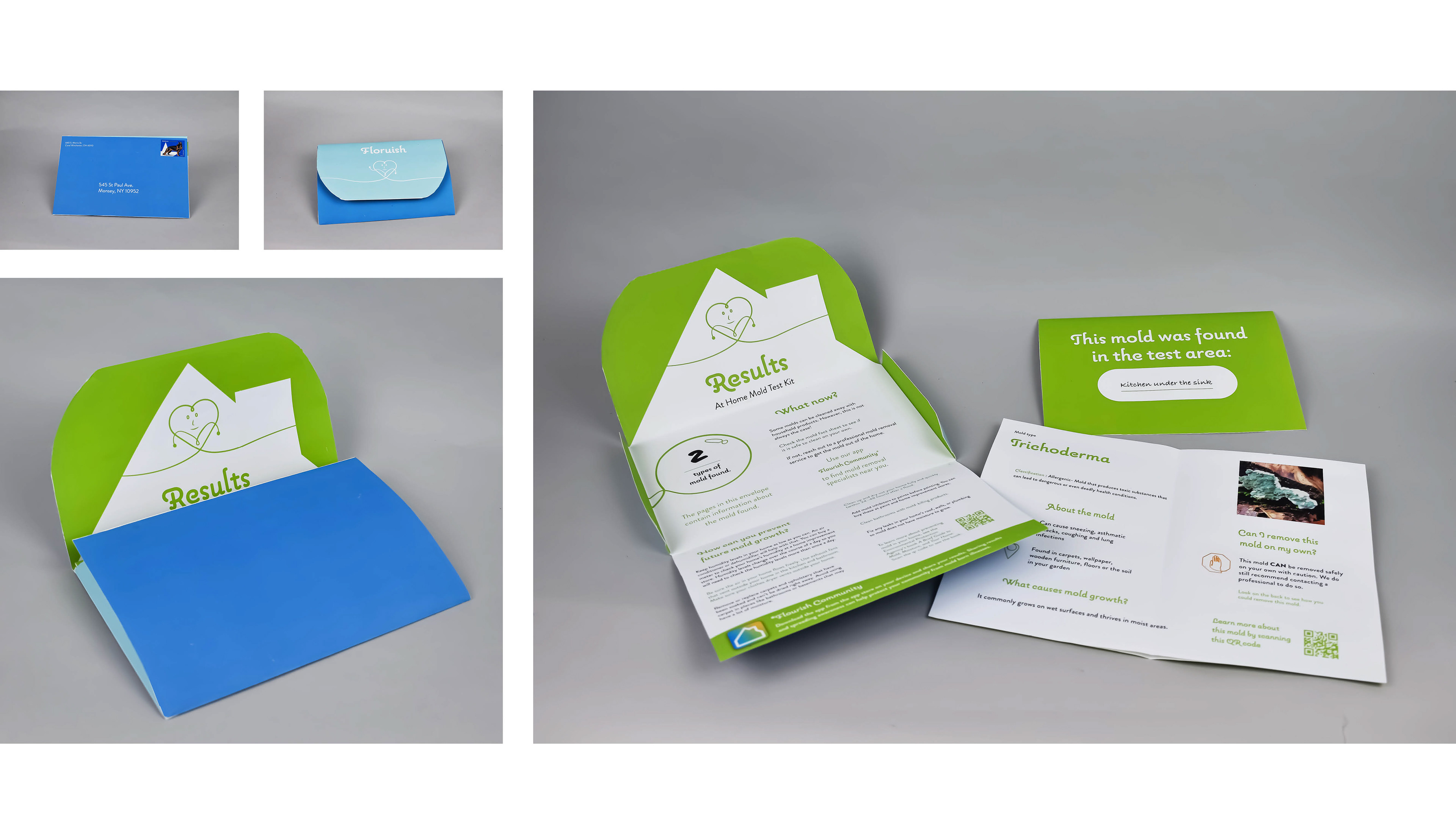
In creating the packaging and branding of Flourish, I wanted it to feel approachable to mitigate fear in favor of proactive behavior. The characters in the system show community support when it comes to health and the line connecting them makes the viewer want to pick up the box and turn it around to see all the information. The structure of the package shows a house. When opened the viewer is presented with a visual of mold that can be hiding in the walls of one’s home. The package provides multiple tests in one kit to allows for testing of more than one area of the home. Lastly, the color establishes a visual identification system used across additional kits (for asbestos, lead and radon).
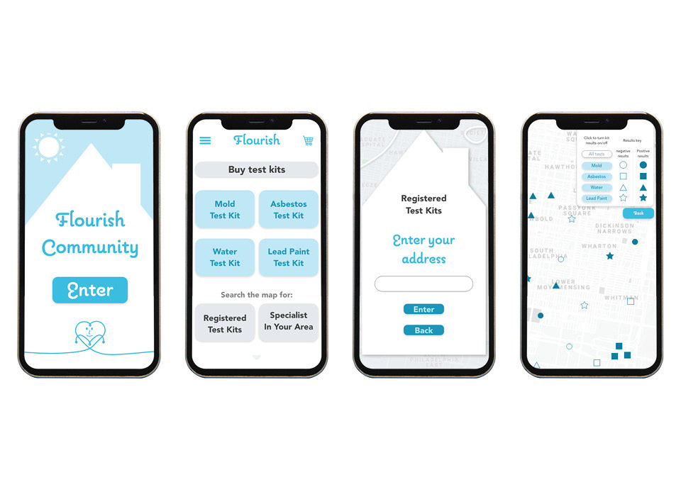
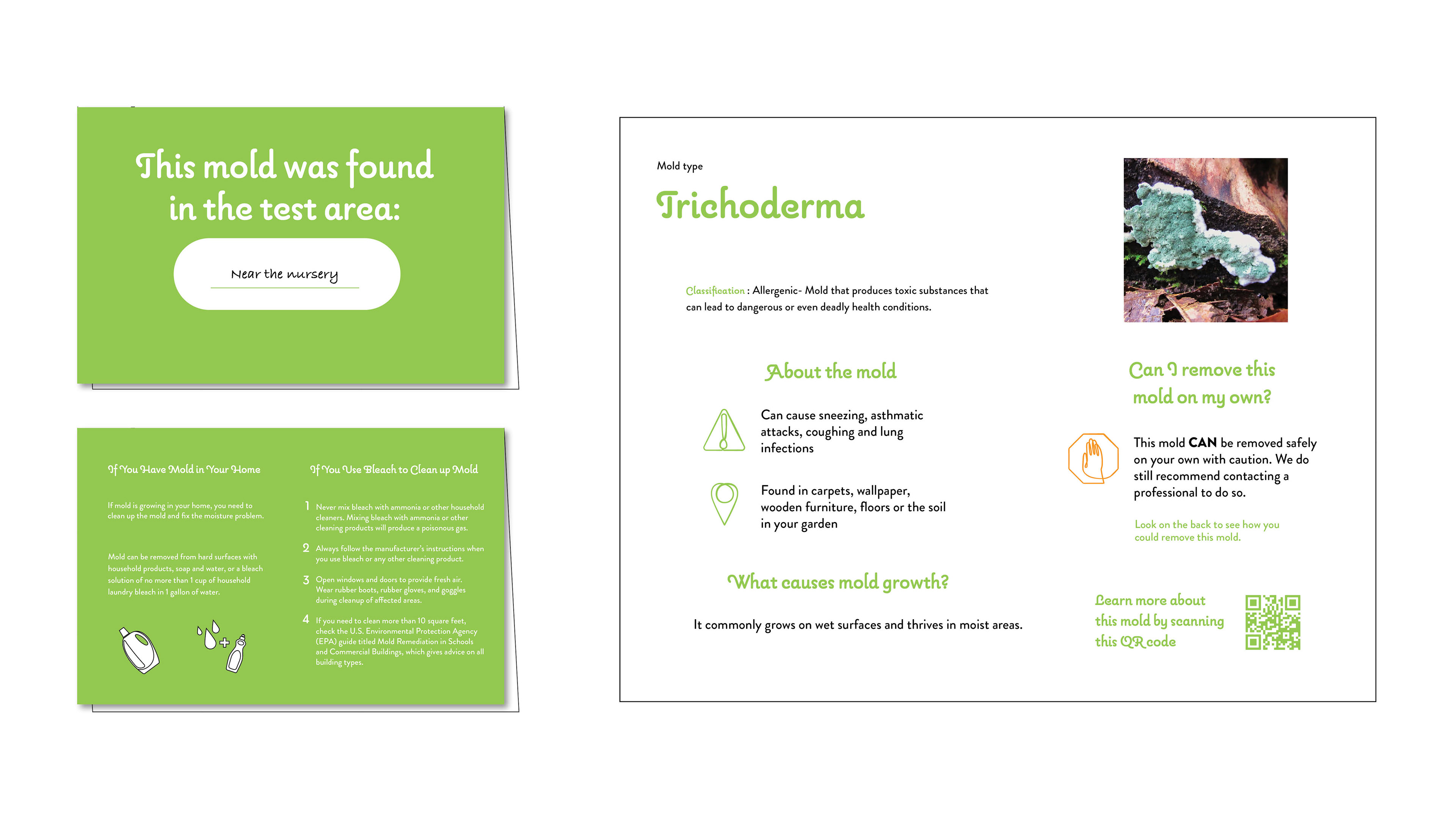
Test results provide data for people to advocate for an optimal
living situation that will allow them to thrive.

The Flourish app supports community connection by sharing others’ test results, with permission. In so doing, Flourish helps to build a stronger community response and a more proactive approach to safe home environments. Flourish also looks to connect people with professional mitigation services.